Data Extraction
Note: Please ensure that you have completed the Get Started section before diving into and attempting to make use of any of the below features.
The web SDK provides two different ways of integrating identity data extraction functionality into your project.
You can either use our pre-built components which can be configured and styled for your needs, or you can completely build the UI yourself and make use of our JavaScript API to integrate with our data extraction functionality.
Components
The following components are available:
It is recommended that you use the wizard component, which encapsulates and orchestrates the other components in a flow. It can be set up using configuration options relevant to your use case. You may also use each component separately if you choose.
Country Select Component
This component can be found under the Sybrin.Identity namespace and is called CountrySelectComponent.
Full name: Sybrin.Identity.CountrySelectComponent.
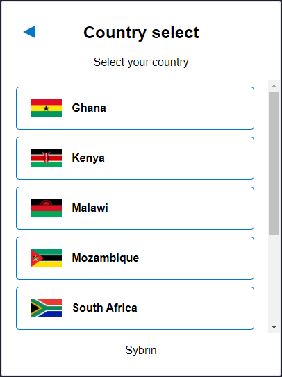
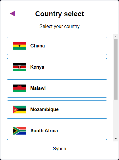
It is a component that provides basic country selection functionality in the form of a simple UI. The Web SDK requires a country code for data extraction and it's recommended that you use this component to obtain said country code.
With default styling, the country select component appears as follows:
Upon selecting a country, the onCountrySelected event will fire, passing the selected country code as a string parameter.
Initialization
The country select component can be initialized using the following code:
The Sybrin Web SDK provides the option to either pass down the ID of the element you wish to use for component initialization, or to pass the element directly.
Please note that 'country-select' is just an example in this context and the ID may be changed as desired as long as it matches the value passed down during component initialization in JavaScript.
During initialization, the country select component allows for a number of configuration options that may be passed down using an object literal. The parameters that may be used on the object include the following:
Required:
id (string): ID of the element you wish to use for component initialization. Not required ifelementis passed.element (HTMLElement): Element you wish to use for component initialization. Not required ifidis passed.
Optional:
documentTypeName (string): The document type name to filter country selection by. If a document type name is passed down, only countries that support the specified document type will be shown. Please see document type overrides & filtering for a list of accepted values.countries (Sybrin.Identity.Country[]): Explicit country filter. Please see country overrides & filtering for details.
For altering component text or implementing localization if required:
headingText (string): Text to display in the heading. Default "Country select"subtitleText (string): Text to display in the subtitle. Default "Select your country"companyText (string): Company text to display at the foot of the component. Default "Sybrin"
Warning: Initialization will fail if the intended host element does not exist yet.
Always ensure that the initialize function is only called after the DOM is loaded.
Country Overrides & Filtering
When creating an instance of the country select component, the SDK allows for a documentTypeNamestring parameter, which will be used to filter countries based on the document type. Additionally, the SDK allows for a countries parameter which can be used for more specific override options. The countries parameter is a collection of Sybrin.Identity.Country where each instance has the properties code, name and enabled.
code (string): The unique identifier used to target a country to override.name (string): Can be used to override the display name of the targeted country.enabled (boolean): Can be used to filter out the targeted country (if set to false)
Supported country codes are:
Ghana:
'GHA'Kenya:
'KEN'Malawi:
'MWI'Mozambique:
'MOZ'South Africa:
'ZAF'Uganda:
'UGA'Zimbabwe:
'ZWE'
Advanced filtering and override example:
By specifying documentTypeName as 'idcard', it will only show countries that support the ID Card document type. The first country instance in the countries collection overrides 'ZAF', which is South Africa, to display as Southern Africa instead. The second instance filters 'UGA', which is Uganda, out so that it doesn't appear as part of the list even though the Ugandan ID Card document type is supported.
Destruction
The country select component may be removed from the UI by calling the destroy() function on it.
Example:
Events
The country select component offers one event for reacting to country selection. To hook onto the event, simply assign a function to it.
The following option is available:
onCountrySelected(countryCode: string)
On Country Selected
This function is called when a country is selected. To hook onto the event, you may use the following code:
The countryCode parameter is of type string.
Styling
The country select component is structured a follows:
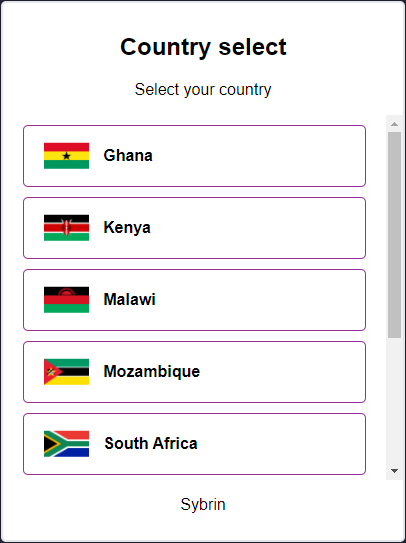
The classes and elements specified above may be used to freely style the country select component as desired. To do so, simply create a stylesheet and include it in the project, then style according to the above classes and elements.
The element with the sybrin-identity-card class repeats for every country option.
Styling implementation example:
Before styling | After styling |
Document Select Component
This component can be found under the Sybrin.Identity namespace and is called DocumentSelectComponent.
Full name: Sybrin.Identity.DocumentSelectComponent.
It is a component that provides basic document selection functionality in the form of a simple UI. The Web SDK requires a document type for data extraction and it's recommended that you use this component to obtain said document type.
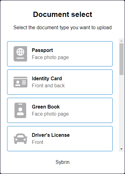
With default styling, the document select component appears as follows:
Upon selecting a document, the onDocumentSelected event will fire, passing the selected document type as a string parameter.
Initialization
The document select component can be initialized using the following code:
The Sybrin Web SDK provides the option to either pass down the ID of the element you wish to use for component initialization, or to pass the element directly.
Please note that 'document-select' is just an example in this context and the ID may be changed as desired as long as it matches the value passed down during component initialization in JavaScript.
During initialization, the document select component allows for a number of configuration options that may be passed down using an object literal. The parameters that may be used on the object include the following:
Required:
id (string): ID of the element you wish to use for component initialization. Not required ifelementis passed.element (HTMLElement): Element you wish to use for component initialization. Not required ifidis passed.
Optional:
countryCode (string): The Alpha-3 standard country code to filter document selection by. If a country code is passed down, only documents supported by the specified country will be shown. Please see country overrides & filtering for a list of accepted values.documentTypes (Sybrin.Identity.DocumentType[]): Explicit document type filter. Please see document type overrides & filtering for details.
For altering component text or implementing localization if required:
headingText (string): Text to display in the heading. Default "Country select"subtitleText (string): Text to display in the subtitle. Default "Select your country"companyText (string): Company text to display at the foot of the component. Default "Sybrin"
Document Type Overrides & Filtering
When creating an instance of the document select component, the SDK allows for an Alpha-3 standard countryCodeparameter, which will be used to filter document types based on the country. Additionally, the SDK allows for a documentTypes parameter which can be used for more specific override options. The parameter is a collection of objects where each instance has the properties name, title, subtitle and enabled.
id (string): The unique identifier (document type ID) used to target a document type to override.title (string): Can be used to override the display title of the targeted document type.subtitle (string): Can be used to override the display subtitle of the targeted document typeenabled (boolean): Can be used to filter out the targeted document type (if set to false)frontThreshold (number): The confidence threshold value to use when running document detection on the front image. A lower value modifies detection to be more sensitive. A higher level makes it less sensitive, up to a maximum of 100.backThreshold (number): The confidence threshold value to use when running document detection on the back image if applicable. A lower value modifies detection to be more sensitive. A higher level makes it less sensitive, up to a maximum of 100.
Supported document type IDs are:
Ghana
Passport:
'ghapassport'(Document type name = 'passport')
Kenya
Passport:
'kenpassport'(Document type name = 'passport')ID Card:
'kenidcard'(Document type name = 'idcard')
Malawi
Passport:
'mwipassport'(Document type name = 'passport')
Mozambique
Passport:
'mozpassport'(Document type name = 'passport')ID Card:
'mozidcard'(Document type name = 'idcard')
South Africa
Passport:
'zafpassport'(Document type name = 'passport')ID Card:
'zafidcard'(Document type name = 'idcard')Green Book:
'zafgreenbook'(Document type name = 'greenbook')
Uganda
Passport:
'ugapassport'(Document type name = 'passport')ID Card:
'ugaidcard'(Document type name = 'idcard')
Zimbabwe
Passport:
'zwepassport'(Document type name = 'passport')
Philippines
Passport:
'phlpassport'(Document type name = 'passport')ID Card:
'phlidcard'(Document type name = 'idcard')Divers License:
'phldriverslicense'(Document type name = 'driverslicense')Seaman's Book:
'phlseamansbook'(Document type name = 'seamansbook')Seaman's ID:
'phlsid'(Document type name = 'sid')Postal ID:
'phlpostalid'(Document type name = 'postalid')Social Security:
'phlsocialsecurity'(Document type name = 'socialsecurity')Unified Multi Purpose:
'phlunifiedmultipurpose'(Document type name = 'unifiedmultipurpose')Firearms License:
'phlfirearmslicense'(Document type name = 'firearmslicense')Old PRC ID (Before September 2019):
'phlprofessionalregulationsblue'(Document type name = 'professionalregulations')PRC ID (After September 2019):
'phlprofessionalregulations'(Document type name = 'professionalregulations')Integrated Bar:
'phlintegratedbar'(Document type name = 'integratedbar')Insurance Card:
'phlinsurancecard'(Document type name = 'insurancecard')Health Insurance Card:
'phlhealthinsurancecard'(Document type name = 'healthinsurancecard')
The generic document type IDs that would apply globally correspond to the document type names. They are:
Passport:
'passport'ID Card:
'idcard'Green Book:
'greenbook'Driver's License:
'driverslicense'Seaman's Book:
'seamansbook'Seaman's ID:
'sid'Postal ID:
'postalid'Social Security:
'socialsecurity'Unified Multi Purpose ID:
'unifiedmultipurpose'Firearms License:
'firearmslicense'Professional Regulations Commission ID:
'professionalregulations'Integrated Bar of the Philippines ID:
'integratedbar'Insurance Card:
'insurancecard'Health Insurance Card:
'healthinsurancecard'
Advanced filtering and override example:
By specifying countryCode as 'ZAF', it will only show document types that are supported by South Africa. The document type instance in the documentTypes collection overrides 'zafidcard' (South African ID Card) to display the title as 'ID Card' and subtitle as 'Your identity card' instead. The second instance filters 'zafgreenbook' (South African Green Book) out so that it doesn't appear as part of the list even though it is a supported South African document.
Destruction
The document select component may be removed from the UI by calling the destroy() function on it.
Example:
Events
The document select component offers one event for reacting to document selection. To hook onto the event, simply assign a function to it.
The following option is available:
onDocumentSelected(documentTypeName: string, documentTypeId: string)
On Document Selected
This function is called when a document is selected and provides the selected document's type name and, if applicable, document type ID as arguments. The ID will only be passed as an argument if the country code is known to the component at the time of selection. To hook onto the event, you may use the following code:
The documentTypeName parameter is of type string.
The documentTypeId parameter is of type string.
Styling
The document select component is structured a follows:
The classes and elements specified above may be used to freely style the country select component as desired. To do so, simply create a stylesheet and include it in the project, then style according to the above classes and elements.
The element with the sybrin-identity-card class repeats for every document option and has a specific class to identify it by:sybrin-identity-document-select-card-dtn where dtn is the document type name of the document option.
Styling implementation example:
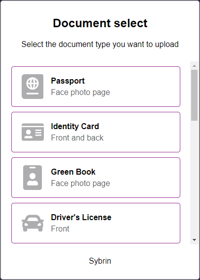
Before styling | After styling |
Document Scan Component
This component can be found under the Sybrin.Identity namespace and is called DocumentScanComponent.
Full name: Sybrin.Identity.DocumentScanComponent.
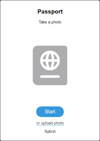
It is a component that wraps the identity data extraction detection functionality provided by the Sybrin Identity JavaScript API and presents it in the form of a simple UI. It's recommended that you use this component if you do not wish to create your own UI and simply want to use the identity data extraction functionality provided by the Sybrin Identity Web SDK.
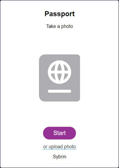
With default styling, the document scan component appears as follows:
Upon clicking "Start", the user will be prompted with instructions on how to take a viable image for document extraction. Upon proceeding, the user's camera will initialize and the component will display a video feed while the user centers their document inside the rectangle. This action can be cancelled, resulting in the onScanCancelled event firing. Alternatively, the user may click on the text link to upload a photo instead. This will result in a file browser window appearing and will allow the user to select a file.
If an error occurs, the onScanError event will fire.
If liveness detection completes, the onScanResult event will fire.
Initialization
The document scan component can be initialized using the following
code:
The Sybrin Web SDK provides the option to either pass down the ID of the element you wish to use for component initialization, or to pass the element directly.
Please note that 'document-scan' is just an example in this context and the ID may be changed as desired as long as it matches the value passed down during component initialization in JavaScript.
During initialization, the document scan component allows for a number of configuration options that may be passed down using an object literal. The parameters that may be used on the object include the following:
Required:
id (string): ID of the element you wish to use for component initialization. Not required ifelementis passed.element (HTMLElement): Element you wish to use for component initialization. Not required ifidis passed.api (Sybrin.Identity.API): Instance of a JavaScript API that may be pre-configured as desired. Not required if an instance ofoptionsis passed.options (Sybrin.Identity.Options): Configuration options to instantiateSybrin.Identity.Apiwith. Not required if an instance ofapiis passed.documentTypeId (string): An ID that points to a unique document type for a specific country. Not required ifcountryCodeanddocumentTypeNameare specified.countryCode (string): The Alpha-3 standard country code of the document to be scanned. Not required ifdocumentTypeIdis passed.documentTypeName (string): The document type to be scanned. Please see document type overrides and filtering for a list of supported document type names. Not required ifdocumentTypeIdis passed.
Optional:
correlationId (string): Unique identifier for the case that will be passed down to the back-end if set.useModal (boolean): Whether or not to pop the video feed out into a modal. By default, this is true.
For altering component text or implementing localization if required:
headingText (string): Text to display in the heading. This will default to the title of the selected document type, or simply "Document" if a selected document title could not be found.subtitleText (string): Text to display in the subtitle. Default "Take a photo"startButtonText (string): Text to display in the start button. Default "Start"gotitButtonText (string): Text to display in the proceed button of the instructions screen. Default "Got it!"cancelButtonText (string): Text to display in the cancel button. Default "Cancel"uploadPhotoText (string): Text to display in the upload photo link. Default "or upload photo"companyText (string): Company text to display at the foot of the component. Default "Sybrin"lightingInstructionText (string): Instruction text stating to ensure proper lighting conditions. Default "Ensure good lighting"alignmentInstructionText (string): Instruction text stating to ensure correct alignment. Default "Ensure correct document alignment"backgroundInstructionText (string): Instruction text stating to ensure that the background is correct. Default "Try to avoid white surface background"
Warning: Initialization will fail if the intended host element does not exist yet.
Always ensure that the initialize function is only called after the DOM is loaded.
Destruction
The document scan component may be removed from the UI by calling the destroy() function on it.
Example:
Events
The document scan component offers multiple events. To hook onto an event, simply assign a function to it.
The following options are available:
onScanResult(result: DocumentScanResult)onScanError(error: string)onScanCancelled()onBeforeScan()onBeforeUpload()
On Scan Result
This function is called when a scan result is acquired without error. To hook onto the event, you may use the following code:
The result parameter is of type Sybrin.Identity.DocumentScanResult and includes the following properties:
success (boolean): Whether or not data could be extracted.message (string): Additional information when applicable, for instance an error message if one occurred.data (object): An object with all data fields that were successfully extracted.images (object): An object with images. These includedocumentImage (string): Base64 string of the front photo of the document.documentBackImage (string): Base64 string of the back photo of the document (if supplied).portraitImage (string): Base64 string of the extracted face portrait image pulled from the document.
On Scan Error
This function is called when something goes wrong and an error occurs during data extraction. To hook onto the event, you may use the following code:
The error parameter is of type string.
On Scan Cancelled
This function is called when a document scan for data extraction was started, but then cancelled before completion. To hook onto the event, you may use the following code:
No parameter is passed to this function call.
On Before Scan
This function is called before the camera feed is launched when document scan starts. It is recommended to use this function to set the correlationId of the component by calling setCorrelationId(). To hook onto the event, you may use the following code:
No parameter is passed to this function call.
On Before Upload
This function is called before the file upload window appears. It is recommended to use this function to set the correlationId of the component by calling setCorrelationId(). To hook onto the event, you may use the following code:
No parameter is passed to this function call.
Styling
The document scan component is structured a follows:
The classes and elements specified above may be used to freely style the document scan component as desired. To do so, simply create a stylesheet and include it in the project, then style according to the above classes and elements.
Depending on component state, visibility of certain div elements alternates.
When idle...
sybrin-identity-document-scan-imageis shownsybrin-identity-document-scan-videois hiddensybrin-identity-document-scan-startis shownsybrin-identity-document-scan-cancelis hidden
When running identity data extraction...
sybrin-identity-document-scan-imageis hiddensybrin-identity-document-scan-videois shownsybrin-identity-document-scan-startis hiddensybrin-identity-document-scan-cancelis shown
Styling implementation example:
Before styling | After styling |
Result Component
This component can be found under the Sybrin.Identity namespace and is called ResultComponent.
Full name: Sybrin.Identity.ResultComponent.
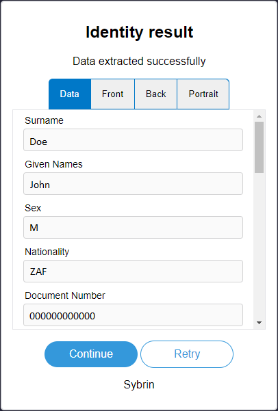
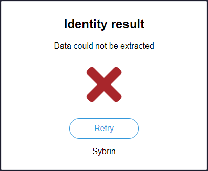
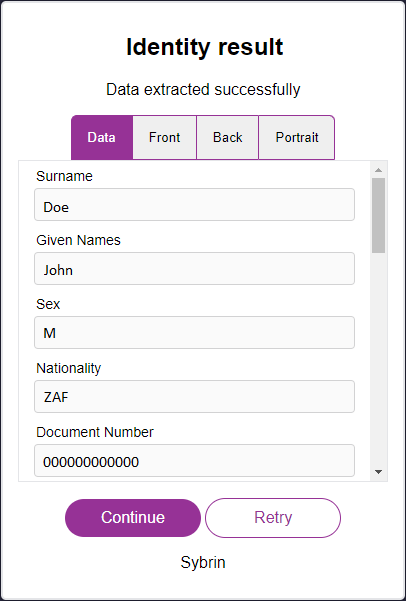
It is a component that displays the result of a document scan provided by the Sybrin Identity JavaScript API and presents it in the form of a UI component. The result is presented in a set of tabs, the first of which showing the extracted metadata and the rest showing images relevant to the extracted data: Front, back and portrait. It's recommended that you use this component if you do not wish to create your own UI and simply want to display a result provided by a completion of the Sybrin Identity Web SDK identity data extraction process.
The document scan result may be obtained by either using an instance of the JavaScript API or by using a component such as DocumentScanComponent to run data extraction.
With default styling, the result component appears as follows:
Success: True | Success: False |
Upon clicking "Continue", the onContinue event will fire.
Upon clicking "Retry", the onRetry event will fire.
Initialization
The result component can be initialized using the following code:
The Sybrin Web SDK provides the option to either pass down the ID of the element you wish to use for component initialization, or to pass the element directly.
Please note that 'result' is just an example in this context and the ID may be changed as desired as long as it matches the value passed down during component initialization in JavaScript.
During initialization, the result component allows for a number of configuration options that may be passed down using an object literal. The parameters that may be used on the object include the following:
Required:
id (string): ID of the element you wish to use for component initialization. Not required ifelementis passed.element (HTMLElement): Element you wish to use for component initialization. Not required ifidis passed.result (Sybrin.Identity.DocumentScanResult): TheSybrin.Identity.DocumentScanResultinstance to construct the UI with.
For altering component text or implementing localization if required:
headingText (string): Text to display in the heading. Default "Identity result"subtitleSuccessText (string): Success text to display in the subtitle. Default "Data extracted successfully"subtitleFailText (string): Fail text to display in the subtitle. Default "Data could not be extracted"continueButtonText (string): Text to display in the continue button. Default "Continue"retryButtonText (string): Text to display in the retry button. Default "Retry"dataTabText (string): Text to display on the tab button of the data tab. Default "Data"frontTabText (string): Text to display on the tab button of the front image tab. Default "Front"backTabText (string): Text to display on the tab button of the back image tab. Default "Back"portraitTabText (string): Text to display on the tab button of the portrait image tab. Default "Portrait"companyText (string): Company text to display at the foot of the component. Default "Sybrin"
Warning: Initialization will fail if the intended host element does not exist yet.
Always ensure that the initialize function is only called once the DOM is loaded.
Destruction
The result component may be removed from the UI by calling the "destroy()" function on it.
Example:
Events
The result component offers multiple events. To hook onto an event, simply assign a function to it.
The following options are available:
onContinue()onRetry()
On Continue
This function is called when the user clicks on the continue button. To hook onto the event, you may use the following code:
No parameter is passed to this function call.
On Retry
This function is called when the user clicks on the retry button. To hook onto the event, you may use the following code:
No parameter is passed to this function call.
Styling
The result component is structured a follows:
The classes and elements specified above may be used to freely style the result component as desired. To do so, simply create a stylesheet and include it in the project, then style according to the above classes and elements.
The identity result component is dynamic. The presence and visibility of tab buttons and content may vary.
For example, the "back" tab and content elements (marked with "sybrin-identity-result-tab-button-back" and "sybrin-identity-result-back" respectively) do not exist on the component when the document does not require a back image capture.
The "sybrin-identity-result-tab-button-active" class is used to determine selected button styling.
The "sybrin-identity-tab-item-active" class is used to determine active content block visibility.
Styling implementation example:
Before styling | After styling |
Wizard Component
This component can be found under the Sybrin.Identity namespace and is called WizardComponent.
Full name: Sybrin.Identity.WizardComponent.
It is a component that wraps and orchestrates the:
Apart from displaying the component for the currently active step, the only visual element that the wizard component adds is a back button in the top left corner when not on the first step. With default styling, the button appears as follows:
As the user interacts with components housed within the wizard component, it will automatically progress and keep track of steps.
Initialization
The wizard component can be initialized using the following code:
The Sybrin Web SDK provides the option to either pass down the ID of the element you wish to use for component initialization, or to pass the element directly.
Please note that 'wizard' is just an example in this context and the ID may be changed as desired as long as it matches the value passed down during component initialization in JavaScript.
During initialization, the wizard component allows for a number of configuration options that may be passed down using an object literal. The parameters that may be used on the object include the following:
Required:
id (string): ID of the element you wish to use for component initialization. Not required ifelementis passed.element (HTMLElement): Element you wish to use for component initialization. Not required ifidis passed.api (Sybrin.Identity.Api): Instance of a JavaScript API that may be pre-configured as desired. Not required if an instance ofoptionsis passed.options (Sybrin.Identity.Options): Configuration options to instantiateSybrin.Identity.Apiwith. Not required if an instance ofapiis passed.
Optional:
correlationId (string): Unique identifier for the case that will be passed down to the back-end if set.steps (string): A collection of strings to specify/override the steps that the wizard should display, as well as their order. The string values may be:'country-select'to specify the country select component.'document-select'to specify the document select component.'scan'to specify the document scan component.'result'to specify the result component.
selectedDocumentTypeId (string): The default ID that points to a unique document type for a specific country if both the country select component and the document select component are excluded as a step in the wizard component. Can be used as a singular alternative to providingselectedCountryCodeandselectedDocumentTypeName.selectedCountryCode (string): The default country code to use if the country select component is excluded as a step in the wizard component.selectedDocumentTypeName (string): The default document type name code to use if the document select component is excluded as a step in the wizard component.countries (Sybrin.Identity.Country[]): Explicit country filter to be used by the country select component. Please see country overrides & filtering for details.documentTypes (Sybrin.Identity.DocumentType[]): Explicit document type filter to be used by the document select component. Please see document type overrides & filtering for details.documentScanUseModal (boolean): Passed to the document scan component to determine whether or not to pop the video feed out into a modal. Default truereadonlyMode (boolean): Disables all events if true. Default false
For altering component text or implementing localization if required (Please see the sections on relevant components for more details):
countrySelectHeadingText (string): Passed to the country select component as heading text.countrySelectSubtitleText (string): Passed to the country select component as subtitle text.documentScanHeadingText (string): Passed to the document scan component as heading text.documentScanSubtitleText (string): Passed to the document scan component as subtitle text.documentScanStartButtonText (string): Passed to the document scan component as start button text.documentScanGotitButtonText (string): Passed to the document scan component as proceed button text.documentScanCancelButtonText (string): Passed to the document scan component as cancel button text.documentScanUploadPhotoText (string): Passed to the document scan component as upload photo text.documentScanLightingInstructionText (string): Passed to the document scan component as lighting instruction text.documentScanAlignmentInstructionText (string): Passed to the document scan component as alignment instruction text.documentScanBackgroundInstructionText (string): Passed to the document scan component as background instruction text.documentSelectHeadingText (string): Passed to the document select component as heading text.documentSelectSubtitleText (string): Passed to the document select component as subtitle text.resultHeadingText (string): Passed to the result component as heading text.resultSubtitleSuccessText (string): Passed to the result component as subtitle success text.resultSubtitleFailText (string): Passed to the result component as subtitle fail text.resultContinueButtonText (string): Passed to the result component as continue button text.resultRetryButtonText (string): Passed to the result component as retry button text.resultDataTabText (string): Passed to the result component as data tab text.resultFrontTabText (string): Passed to the result component as front tab text.resultBackTabText (string): Passed to the result component as back tab text.resultPortraitTabText (string): Passed to the result component as portrait tab text.companyText (string): Company text to display at the foot of all components.
Warning: Initialization will fail if the intended host element does not exist yet.
Always ensure that the initialize function is only called after the DOM is loaded.
Destruction
The wizard component may be removed from the UI by calling the destroy() function on it.
Example:
Events
The wizard component offers multiple events. To hook onto an event, simply assign a function to it.
The following options are available:
onWizardDone(result: DocumentScanResult)onBeforeStepChanged(oldStep: string, newStep: string)onAfterStepChanged(oldStep: string, newStep: string)onScanResult(result: DocumentScanResult)onScanError(error: string)onScanCancelled()onBeforeScan()onBeforeUpload()onCountrySelected(countryCode: string)onDocumentSelected(documentTypeName: string, documentTypeId: string)
On Wizard Done
This function is called when all wizard steps have been completed and a result was acquired without error. To hook onto the event, you may use the following code:
The result parameter is of type DocumentScanResult and includes the following properties:
success (boolean): Whether or not data could be extracted.data (object): An object with all data fields that were successfully extracted.images (object): An object with images. These includedocumentImage (string): Base64 string of the front photo of the document.documentBackImage (string): Base64 string of the back photo of the document (if supplied).portraitImage (string): Base64 string of the extracted face portrait image pulled from the document.
On Before Step Changed
This function is called before the wizard changes to another step. This includes progressing forward or going back to a previous step. To hook onto the event, you may use the following code:
The oldStep parameter is of type string.
The newStep parameter is of type string.
On After Step Changed
This function is called after the wizard changed to another step. This includes progressing forward or going back to a previous step. To hook onto the event, you may use the following code:
The oldStep parameter is of type string.
The newStep parameter is of type string.
On Scan Result
This event bubbles the onScanResult event up once it executes on the document scan component.
On Scan Error
This event bubbles the onScanError event up once it executes on the document scan component.
On Scan Cancelled
This event bubbles the onScanCancelled event up once it executes on the document scan component.
On Before Scan
This event bubbles the onBeforeScan event up once it executes on the document scan component.
On Before Upload
This event bubbles the onBeforeUpload event up once it executes on the document scan component.
On Country Selected
This event bubbles the onCountrySelected event up once it executes on the country select component.
On Document Selected
This event bubbles the onDocumentSelected event up once it executes on the document select component.
Styling
The wizard component is structured a follows:
The classes and elements specified above may be used to freely style the wizard component as desired. To do so, simply create a stylesheet and include it in the project, then style according to the above classes and elements.
Styling implementation example:
Before styling | After styling |
JavaScript API
If you wish to use the functionality provided by the Sybrin Identity Web SDK but create your own UI entirely, you may achieve this by simply creating an instance of the JavaScript API and using the functions exposed by it.
Initialization
The JavaScript API may be initialized as follows:
The options object may be used to configure the API as desired.
Configuration Options
The following properties are exposed as configuration options:
Required
apiKey (string): Your API key as provided by Sybrin.authorizationEndpoint (string): The endpoint that will be used to authorize.dataExtractionEndpoint (string): The endpoint that will be used to execute data extraction.
Optional
assetHeaders: (dictionary<string, any>): A dictionary of strings as keys and any value types, used to construct request headers when performing asset retrievals.authHeaders: (dictionary<string, any>): A dictionary of strings as keys and any value types, used to construct request headers when performing the authorization API call.blurThreshold (number): The threshold that the blur detection algorithm must pass for the image to be considered clear enough. A higher value is more strict. A lower value is less strict. Default 6.5dataExtractionHeaders: (dictionary<string, any>): A dictionary of strings as keys and any value types, used to construct request headers when performing the data extraction API call.documentDetectionInterval (number): The interval (in milliseconds) at which document detection should run on the video feed. Default 500.extractionBackParamName (string): The parameter name of the back image to run data extraction on.extractionFrontParamName (string): The parameter name of the front image to run data extraction on.instructionTextPosition (string: top | bottom | topandbottom): Location of the instruction text while the video feed is being processed. The default value is "topandbottom".mediaStreamStartTimeout (integer): The time (in milliseconds) that the SDK is given to enable and hook onto the user's camera before it times out. The default value is 6000.overexposedThreshold (number): The percentage of overexposed pixels that should be present for an image to be considered overexposed. Default 50.overexposedValue (number): The grayscale RGB value (0-255) that a pixel's color must be larger than in order to be considered overexposed. Default 220.samplesPath (string): Path to the samples used for document detection. Default "assets/samples"takePictureDelay (number): The delay (in milliseconds) before the photo is taken once a document is detected in frame. Default 2000.thresholdAdjustFactor (number): The factor at which to apply the confidence adjustment when it occurs. Default 0.8.thresholdAdjustInterval (number): The interval (in milliseconds) at which to adjust the confidence threshold on the current document. Default 10000.underexposedThreshold (number): The percentage of underexposed pixels that should be present for an image to be considered underexposed. Default 40.underexposedValue (number): The grayscale RGB value (0-255) that a pixel's color must be smaller than in order to be considered underexposed. Default 30.
Component text and localization
messageBlurry (string): Text prompt to display when the video feed is too blurred. Default "Image too blurry"messageCapturingBack (string): Text prompt to display while capturing the back image. Default "Taking back photo"messageCapturingFront (string): Text prompt to display while capturing the front image. Default "Taking front photo"messageLightingBright (string): Text prompt to display when the video feed is overexposed. Default "Lighting conditions too bright"messageLightingDark (string): Text prompt to display when the video feed is underexposed. Default "Lighting conditions too dark"messagePrepareBack (string): Text prompt to display while waiting for the user to flip the document over and prepare the back for capture.Default "Please flip the document over"
messagePrepareFront (string): Text prompt to display while waiting for the user to prepare the front of a document for capture. Default "Please hold the document up to the camera"messagePreparing (string): Text prompt to display while initializing the video stream. Default "Preparing..."
Functionality
The Sybrin Identity Javascript API provides multiple ways of running data extraction on identity documents and other functions to control the Web SDK.
These include:
Extract Data Using Camera
Extract Data Using File Upload
Cancel
Additionally, the API provides:
Version Information Retrieval
Client Information Retrieval
Extract Data Using Camera
To use the camera for data extraction, you may make use of the openScanDocument function exposed by the JavaScript API.
An argument, passed as an object literal, is required for this function call. The object literal must have these required properties:
documentTypeId (string): The ID that points to a unique document type for a specific country. Not required ifcountryCodeanddocumentTypeNameare specified.countryCode (string): The country that data extraction should run for. Not required ifdocumentTypeIdis specified.documentTypeName (string): The document type that data extraction should run for. Not required ifdocumentTypeIdis specified.
Optionally you may also specify the following properties:
id (string): The ID of the element to create the video feed in. Theelementproperty takes precedence over theidproperty.element (HTMLElement): The element to create the video feed in. Takes precedence over theidproperty.correlationId (string): Value that is used to associate the result with a specific case.
If no id or element property is passed on the argument, the Web SDK will temporarily inject a full screen element to display the video feed.
The function returns a promise, so you may choose to use either the asynchronous await pattern or to subscribe to the result using .then(), .catch() and .finally().
Example:
Extract Data Using File Upload
To use a file upload for data extraction, you may make use of the uploadDocument function exposed by the JavaScript API.
An argument, passed as an object literal, is required for this function call. The object literal must have these required properties:
documentTypeId (string): The ID that points to a unique document type for a specific country. Not required ifcountryCodeanddocumentTypeNameare specified.countryCode (string): The country that data extraction should run for. Not required ifdocumentTypeIdis specified.documentTypeName (string): The document type that data extraction should run for. Not required ifdocumentTypeIdis specified.
Optionally you may also specify the following properties:
frontFile (File): The front image file to run data extraction on.backFile (File): The back image file to run data extraction on.frontBase64 (string): A base64 string of the front image to run data extraction on.backBase64 (string): A base64 string of the back image to run data extraction on.correlationId (string): Value that is used to associate the result with a specific case.loaderContainer (HTMLElement): The HTML element to display a loader inside while processing.
The frontFile, backFile, frontBase64 and backBase64 properties offer an opportunity to implement your own method of obtaining files for upload. If none of these are passed, the Web SDK will invoke the default file explorer window provided by the browser to allow for front (as well as back, if required for the document type) file selection.
If you wish to provide the front file, only one parameter between frontFile and frontBase64 is required.
If you wish to provide the back file where applicable, only one parameter between backFile and backBase64 is required.
The function returns a promise, so you may choose to use either the asynchronous await pattern or to subscribe to the result using .then(), .catch() and .finally().
Example:
Cancel
A function to cancel any action that the identity Web SDK is currently executing. This is useful if you wish to add a cancel button to the UI so that the user may stop data extraction while it's in progress.
Example:
Version Information Retrieval
To get all version info regarding the Web SDK and its components, the API exposes a function called getVersionInfo.
Usage example:
The result has the following properties:
webSdkVersion (string): The semantic version number of the JavaScript web SDK that is currently in use.
Client Information Retrieval
To get all version info regarding the client environment in which the application is currently running, the API exposes a function called getClientInfo.
Usage example:
The result is of type ClientInfo and has the following properties:
isMobile (boolean): Whether or not the client environment is mobile (tablet or phone).isMobileAndroid (boolean): Whether or not the client environment is running Android.isMobileBlackberry (boolean): Whether or not the client environment is running Blackberry.isIphone (boolean): Whether or not the client environment is running on an iPhone.isIpad (boolean): Whether or not the client environment is running on an iPad.isIpadPro (boolean): Whether or not the client environment is running on an iPad Pro.isIpod (boolean): Whether or not the client environment is running on iPod.isMobileIos (boolean): Whether or not the client environment is running iOS.isMobileOpera (boolean): Whether or not the client environment is mobile Opera.isMobileWindows (boolean): Whether or not the client environment is Windows Mobile.isMac (boolean): Whether or not the client environment is running on Mac.
Demo Application
The code example can be downloaded by clicking the file link below
This is a code example that fully incorporates the Sybrin Identity Web SDK. To use the above example, please ensure the following:
You have an API key as provided by Sybrin
You have the backend API endpoints for authentication and data extraction as provided by Sybrin
Then follow these steps:
Download the
sybrin-identity-websdk-demo-application.zipfile linked aboveExtract the zip file contents
Open index.js
In index.js, replace 'your-api-key-here' with the API key provided by Sybrin
In index.js, replace 'your-auth-endpoint-here' with your backend authorization API endpoint
In index.js, replace 'your-data-extraction-endpoint-here' with your backend data extraction API endpoint
Host the folder in any hostable environment, e.g. IIS
Please remember to supply your API key and endpoints to the configuration options in index.js.
For your convenience in formulating custom styling for all components, sybrin.identity.css is also provided as a base example below.
Last updated