Country Select
This component can be found under the Sybrin.Identity namespace and is called CountrySelectComponent.
Full name: Sybrin.Identity.CountrySelectComponent.
It is a component that provides basic country selection functionality in the form of a simple UI. The Web SDK requires a country code for data extraction and it's recommended that you use this component to obtain said country code.
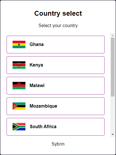
With default styling, the country select component appears as follows:
Upon selecting a country, the onCountrySelected event will fire, passing the selected country code as a string parameter.
Initialization
The country select component can be initialized using the following code:
The Sybrin Web SDK provides the option to either pass down the ID of the element you wish to use for component initialization, or to pass the element directly.
Please note that 'country-select' is just an example in this context and the ID may be changed as desired as long as it matches the value passed down during component initialization in JavaScript.
During initialization, the country select component allows for a number of configuration options that may be passed down using an object literal. The parameters that may be used on the object include the following:
Required:
id (string): ID of the element you wish to use for component initialization. Not required ifelementis passed.element (HTMLElement): Element you wish to use for component initialization. Not required ifidis passed.
Optional:
documentTypeName (string): The document type name to filter country selection by. If a document type name is passed down, only countries that support the specified document type will be shown. Please see document type overrides & filtering for a list of accepted values.countries (Sybrin.Identity.Country[]): Explicit country filter. Please see country overrides & filtering for details.
For altering component text or implementing localization if required:
headingText (string): Text to display in the heading. Default "Country select"subtitleText (string): Text to display in the subtitle. Default "Select your country"companyText (string): Company text to display at the foot of the component. Default "Sybrin"
Warning: Initialization will fail if the intended host element does not exist yet.
Always ensure that the initialize function is only called after the DOM is loaded.
Country Overrides & Filtering
When creating an instance of the country select component, the SDK allows for a documentTypeNamestring parameter, which will be used to filter countries based on the document type. Additionally, the SDK allows for a countries parameter which can be used for more specific override options. The countries parameter is a collection of Sybrin.Identity.Country where each instance has the properties code, name and enabled.
code (string): The unique identifier used to target a country to override.name (string): Can be used to override the display name of the targeted country.enabled (boolean): Can be used to filter out the targeted country (if set to false)
Supported country codes are:
Ghana:
'GHA'Kenya:
'KEN'Malawi:
'MWI'Mozambique:
'MOZ'South Africa:
'ZAF'Uganda:
'UGA'Zimbabwe:
'ZWE'
Advanced filtering and override example:
By specifying documentTypeName as 'idcard', it will only show countries that support the ID Card document type. The first country instance in the countries collection overrides 'ZAF', which is South Africa, to display as Southern Africa instead. The second instance filters 'UGA', which is Uganda, out so that it doesn't appear as part of the list even though the Ugandan ID Card document type is supported.
Destruction
The country select component may be removed from the UI by calling the destroy() function on it.
Example:
Events
The country select component offers one event for reacting to country selection. To hook onto the event, simply assign a function to it.
The following option is available:
onCountrySelected(countryCode: string)
On Country Selected
This function is called when a country is selected. To hook onto the event, you may use the following code:
The countryCode parameter is of type string.
Styling
The country select component is structured a follows:
The classes and elements specified above may be used to freely style the country select component as desired. To do so, simply create a stylesheet and include it in the project, then style according to the above classes and elements.
The element with the sybrin-identity-card class repeats for every country option.
Styling implementation example:
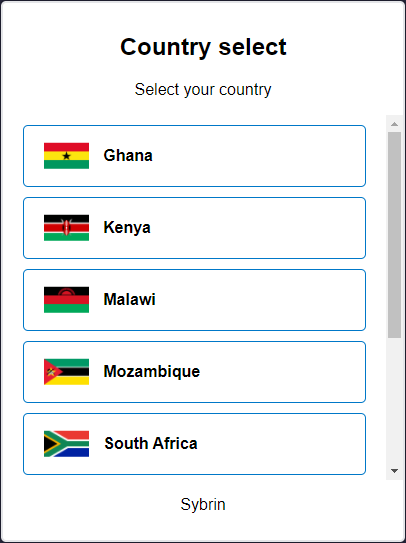
Before styling | After styling |
Last updated