Wizard
This component can be found under the Sybrin.Identity namespace and is called WizardComponent.
Full name: Sybrin.Identity.WizardComponent.
It is a component that wraps and orchestrates the rest of the data extraction components.
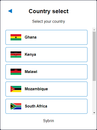
Apart from displaying the component for the currently active step, the only visual element that the wizard component adds is a back button in the top left corner when not on the first step. With default styling, the button appears as follows:
As the user interacts with components housed within the wizard component, it will automatically progress and keep track of steps.
Initialization
The wizard component can be initialized using the following code:
The Sybrin Web SDK provides the option to either pass down the ID of the element you wish to use for component initialization, or to pass the element directly.
Please note that 'wizard' is just an example in this context and the ID may be changed as desired as long as it matches the value passed down during component initialization in JavaScript.
During initialization, the wizard component allows for a number of configuration options that may be passed down using an object literal. The parameters that may be used on the object include the following:
Required:
id (string): ID of the element you wish to use for component initialization. Not required ifelementis passed.element (HTMLElement): Element you wish to use for component initialization. Not required ifidis passed.api (Sybrin.Identity.Api): Instance of a JavaScript API that may be pre-configured as desired. Not required if an instance ofoptionsis passed.options (Sybrin.Identity.Options): Configuration options to instantiateSybrin.Identity.Apiwith. Not required if an instance ofapiis passed.
Optional:
correlationId (string): Unique identifier for the case that will be passed down to the back-end if set.steps (string): A collection of strings to specify/override the steps that the wizard should display, as well as their order. The string values may be:'country-select'to specify the country select component.'document-select'to specify the document select component.'scan'to specify the document select component.'result'to specify the result component.
selectedDocumentTypeId (string): The default ID that points to a unique document type for a specific country if both the country select component and the document select component are excluded as a step in the wizard component. Can be used as a singular alternative to providingselectedCountryCodeandselectedDocumentTypeName.selectedCountryCode (string): The default country code to use if the country select component is excluded as a step in the wizard component.selectedDocumentTypeName (string): The default document type name code to use if the document select component is excluded as a step in the wizard component.countries (Sybrin.Identity.Country[]): Explicit country filter to be used by the country select component. Please see country overrides & filtering for details.documentTypes (Sybrin.Identity.DocumentType[]): Explicit document type filter to be used by the document select component. Please see document type overrides & filtering for details.documentScanUseModal (boolean): Passed to the document scan component to determine whether or not to pop the video feed out into a modal. Default truereadonlyMode (boolean): Disables all events if true. Default false
For altering component text or implementing localization if required (Please see the sections on relevant components for more details):
countrySelectHeadingText (string): Passed to the country select component as heading text.countrySelectSubtitleText (string): Passed to the country select component as subtitle text.documentScanHeadingText (string): Passed to the document scan component as heading text.documentScanSubtitleText (string): Passed to the document scan component as subtitle text.documentScanStartButtonText (string): Passed to the document scan component as start button text.documentScanGotitButtonText (string): Passed to the document scan component as proceed button text.documentScanCancelButtonText (string): Passed to the document scan component as cancel button text.documentScanUploadPhotoText (string): Passed to the document scan component as upload photo text.documentScanLightingInstructionText (string): Passed to the document scan component as lighting instruction text.documentScanAlignmentInstructionText (string): Passed to the document scan component as alignment instruction text.documentScanBackgroundInstructionText (string): Passed to the document scan component as background instruction text.documentSelectHeadingText (string): Passed to the document select component as heading text.documentSelectSubtitleText (string): Passed to the document select component as subtitle text.resultHeadingText (string): Passed to the result component as heading text.resultSubtitleSuccessText (string): Passed to the result component as subtitle success text.resultSubtitleFailText (string): Passed to the result component as subtitle fail text.resultContinueButtonText (string): Passed to the result component as continue button text.resultRetryButtonText (string): Passed to the result component as retry button text.resultDataTabText (string): Passed to the result component as data tab text.resultFrontTabText (string): Passed to the result component as front tab text.resultBackTabText (string): Passed to the result component as back tab text.resultPortraitTabText (string): Passed to the result component as portrait tab text.companyText (string): Company text to display at the foot of all components.
Warning: Initialization will fail if the intended host element does not exist yet.
Always ensure that the initialize function is only called after the DOM is loaded.
Destruction
The wizard component may be removed from the UI by calling the destroy() function on it.
Example:
Events
The wizard component offers multiple events. To hook onto an event, simply assign a function to it.
The following options are available:
onWizardDone(result: DocumentScanResult)onBeforeStepChanged(oldStep: string, newStep: string)onAfterStepChanged(oldStep: string, newStep: string)onScanResult(result: DocumentScanResult)onScanError(error: string)onScanCancelled()onBeforeScan()onBeforeUpload()onCountrySelected(countryCode: string)onDocumentSelected(documentTypeName: string, documentTypeId: string)
On Wizard Done
This function is called when all wizard steps have been completed and a result was acquired without error. To hook onto the event, you may use the following code:
The result parameter is of type DocumentScanResult and includes the following properties:
success (boolean): Whether or not data could be extracted.data (object): An object with all data fields that were successfully extracted.images (object): An object with images. These includedocumentImage (string): Base64 string of the front photo of the document.documentBackImage (string): Base64 string of the back photo of the document (if supplied).portraitImage (string): Base64 string of the extracted face portrait image pulled from the document.
On Before Step Changed
This function is called before the wizard changes to another step. This includes progressing forward or going back to a previous step. To hook onto the event, you may use the following code:
The oldStep parameter is of type string.
The newStep parameter is of type string.
On After Step Changed
This function is called after the wizard changed to another step. This includes progressing forward or going back to a previous step. To hook onto the event, you may use the following code:
The oldStep parameter is of type string.
The newStep parameter is of type string.
On Scan Result
This event bubbles the onScanResult event up once it executes on the document scan component.
On Scan Error
This event bubbles the onScanError event up once it executes on the document scan component.
On Scan Cancelled
This event bubbles the onScanCancelled event up once it executes on the document scan component.
On Before Scan
This event bubbles the onBeforeScan event up once it executes on the document scan component.
On Before Upload
This event bubbles the onBeforeUpload event up once it executes on the document scan component.
On Country Selected
This event bubbles the onCountrySelected event up once it executes on the country select component.
On Document Selected
This event bubbles the onDocumentSelected event up once it executes on the document select component.
Styling
The wizard component is structured a follows:
The classes and elements specified above may be used to freely style the wizard component as desired. To do so, simply create a stylesheet and include it in the project, then style according to the above classes and elements.
Styling implementation example:
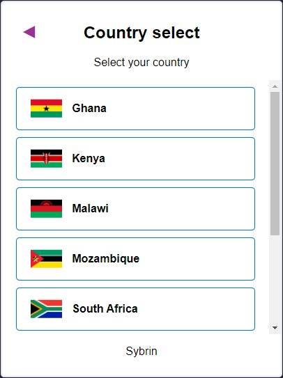
Before styling | After styling |
Last updated