Result
This component can be found under the Sybrin.Identity namespace and is called ResultComponent.
Full name: Sybrin.Identity.ResultComponent.
It is a component that displays the result of a document scan provided by the Sybrin Identity JavaScript API and presents it in the form of a UI component. The result is presented in a set of tabs, the first of which showing the extracted metadata and the rest showing images relevant to the extracted data: Front, back and portrait. It's recommended that you use this component if you do not wish to create your own UI and simply want to display a result provided by a completion of the Sybrin Identity Web SDK identity data extraction process.
The document scan result may be obtained by either using an instance of the JavaScript API or by using a component such as DocumentScanComponent to run data extraction.
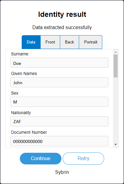
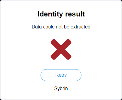
With default styling, the result component appears as follows:
Success: True | Success: False |
Upon clicking "Continue", the onContinue event will fire.
Upon clicking "Retry", the onRetry event will fire.
Initialization
The result component can be initialized using the following code:
The Sybrin Web SDK provides the option to either pass down the ID of the element you wish to use for component initialization, or to pass the element directly.
Please note that 'result' is just an example in this context and the ID may be changed as desired as long as it matches the value passed down during component initialization in JavaScript.
During initialization, the result component allows for a number of configuration options that may be passed down using an object literal. The parameters that may be used on the object include the following:
Required:
id (string): ID of the element you wish to use for component initialization. Not required ifelementis passed.element (HTMLElement): Element you wish to use for component initialization. Not required ifidis passed.result (Sybrin.Identity.DocumentScanResult): TheSybrin.Identity.DocumentScanResultinstance to construct the UI with.
For altering component text or implementing localization if required:
headingText (string): Text to display in the heading. Default "Identity result"subtitleSuccessText (string): Success text to display in the subtitle. Default "Data extracted successfully"subtitleFailText (string): Fail text to display in the subtitle. Default "Data could not be extracted"continueButtonText (string): Text to display in the continue button. Default "Continue"retryButtonText (string): Text to display in the retry button. Default "Retry"dataTabText (string): Text to display on the tab button of the data tab. Default "Data"frontTabText (string): Text to display on the tab button of the front image tab. Default "Front"backTabText (string): Text to display on the tab button of the back image tab. Default "Back"portraitTabText (string): Text to display on the tab button of the portrait image tab. Default "Portrait"companyText (string): Company text to display at the foot of the component. Default "Sybrin"
Warning: Initialization will fail if the intended host element does not exist yet.
Always ensure that the initialize function is only called once the DOM is loaded.
Destruction
The result component may be removed from the UI by calling the "destroy()" function on it.
Example:
Events
The result component offers multiple events. To hook onto an event, simply assign a function to it.
The following options are available:
onContinue()onRetry()
On Continue
This function is called when the user clicks on the continue button. To hook onto the event, you may use the following code:
No parameter is passed to this function call.
On Retry
This function is called when the user clicks on the retry button. To hook onto the event, you may use the following code:
No parameter is passed to this function call.
Styling
The result component is structured a follows:
The classes and elements specified above may be used to freely style the result component as desired. To do so, simply create a stylesheet and include it in the project, then style according to the above classes and elements.
The identity result component is dynamic. The presence and visibility of tab buttons and content may vary.
For example, the "back" tab and content elements (marked with "sybrin-identity-result-tab-button-back" and "sybrin-identity-result-back" respectively) do not exist on the component when the document does not require a back image capture.
The "sybrin-identity-result-tab-button-active" class is used to determine selected button styling.
The "sybrin-identity-tab-item-active" class is used to determine active content block visibility.
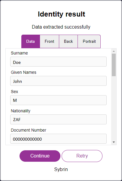
Styling implementation example:
Before styling | After styling |
Last updated