Device Select
The device select component can be found under the Sybrin.Biometrics namespace and is called DeviceSelectComponent.
Full name: Sybrin.Biometrics.DeviceSelectComponent.
It is a component that provides a device selection screen in the event that the user's system has multiple viable video input devices available for use.
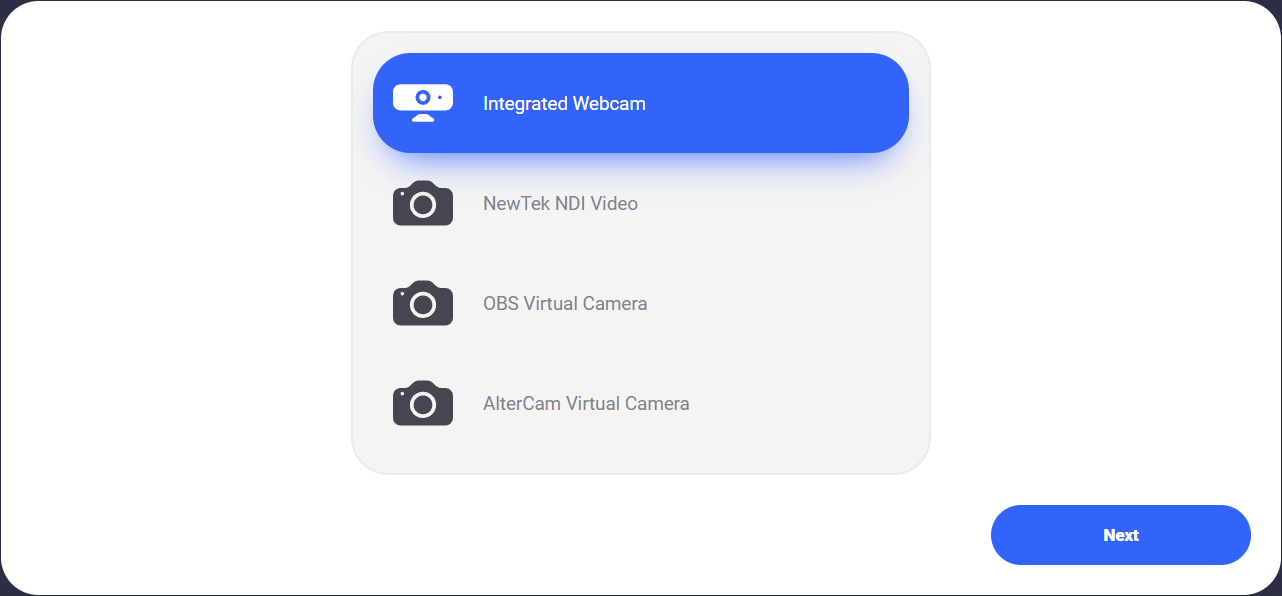
With default styling, the device select component appears as follows:
The "Next" button will remain disabled until a device has been selected. Selection is confirmed upon clicking the "Next" button and then the onDeviceSelected event will fire.
Initialization
The device select component can be initialized using the following code:
The Sybrin Web SDK provides the option to either provide the ID of the element you wish to use for component initialization, or to provide the element directly.
Please note that 'device-select' is just an example in this context and the ID may be changed as desired as long as it matches the value provided during component initialization in JavaScript.
During initialization, the device select component allows for a number of configuration options that may be provided using an object literal. The parameters that may be used on the object include the following:
Required:
id (string): ID of the element you wish to use for component initialization. Not required ifelementis provided.element (HTMLElement): Element you wish to use for component initialization. Not required ifidis provided.
Optional:
api (Sybrin.Biometrics.Api): Instance of a JavaScript API that may be pre-configured as desired. This API instance will be used internally for video input device retrieval. The "options" parameter will be ignored if this parameter is populated.options (Sybrin.Biometrics.Options): Configuration options to instantiate the internalSybrin.Biometrics.Apiwith. If no JavaScript API instance is provided, this parameter will be used to instantiate the internal JavaScript API instance with, which will in turn be used for video input device retrieval.translations ({ [key: string]: string }): An object literal representing a dictionary lookup that will be used for translating the component. Please see the translations section on this page for a list of all translatable text, as well as the localization page for a detailed description on how to implement localization.
Warning: Initialization will fail if the intended host element does not exist yet.
Always ensure that the initialize function is only called after the DOM is loaded.
Destruction
The device select component may be removed from the UI by calling the destroy() function on it.
Example:
Functions
Initialize
initialize(): void
Initializes the component's DOM and events.
Destroy
destroy(): void
Destroys the component's DOM and events.
Set Translations
setTranslations(translations?: { [key: string]: string; }): void
Changes the component's translations to the provided values and updates the DOM accordingly.
Events
The device select component offers one event for reacting to device selection. To hook onto the event, simply assign a function to it.
The following option is available:
onDeviceSelected(device: VideoInputDevice)
On Device Selected
This function is called when a device is selected. To hook onto the event, you may use the following code:
The device parameter is of type VideoInputDevice and has the following properties:
deviceId (string): ID of the device.groupId (string): Group that the device belongs to.type (string: Camera | Webcam | Device): The type of device.direction (string: Front | Back | Integrated): The direction of the device.label (string): A short description of the device.counter (number): Number indicator for the device. Value is 0 unless there are multiple devices of the same type and direction available.
Styling
The device select component is structured a follows:
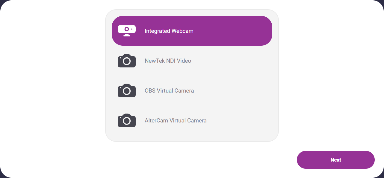
The classes and elements specified above may be used to freely style the device select component as desired. To do so, simply create a stylesheet and include it in the project, then style according to the above classes and elements.
Styling implementation example:
Translations
This component is affected by the following translation keys: